ADin
“A premium digital home for decades of work.”
Client
ADin
Location
New York, USA
Year
2025
Premium
Presence matched to reputation
Clearer
Service discovery and hierarchy
Scalable
Foundation for future content
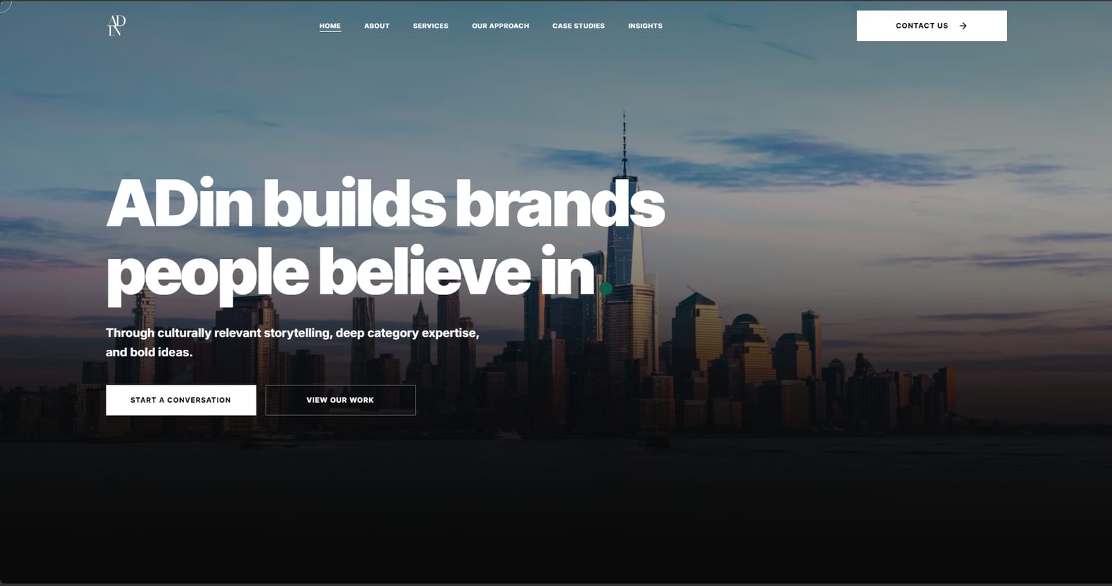
ADIN NYC is a global marketing and communications consultancy working across healthcare, nutrition and life sciences. The substance was already there, in an established body of client work, specialist expertise and a long history in the market. The legacy website did not present it with the clarity, hierarchy or visual confidence the business had earned.
Our approach
Approached as a website strategy exercise before an interface one: business and content discovery, a rebuilt sitemap and information architecture, then UI/UX and a Next.js build with structured content. The portfolio was rebuilt as a business-development asset, with stronger case-study storytelling, clearer service pathways, and consistent presentation of team and client assets, so a first-time visitor can understand the depth of the work at a glance.
A legacy presence, rebuilt as a business development asset
ADIN NYC's web presence was turned into a modern, premium digital experience built to communicate decades of expertise, make the services easier to understand, and turn the agency's extensive body of work into something that actively wins business.
The engagement on one card
- Client and brand
- ADIN NYC
- Industry
- B2B marketing and communications, across healthcare, nutrition and life sciences
- Project type
- Website strategy, information architecture, UI/UX design and full website build
- Core challenge
- The existing digital presence did not communicate the quality, depth and scale of ADIN's work.
- Primary audience
- Prospective clients, partners, media and industry stakeholders evaluating ADIN's capabilities
- Technology
- A Next.js implementation with responsive front-end development and a structured content architecture
- Delivery team
- Growthmak web strategy team
The substance was already there
ADIN had an established body of client work, specialist expertise, case studies, services, team experience and a long history in the market. The website did not present any of it with the clarity, hierarchy or visual confidence the business had earned.
- A legacy site structure that made the breadth of ADIN's capabilities harder to understand at a glance.
- Case studies and service information that needed stronger storytelling and a clearer visual hierarchy.
- Content and imagery that required consolidation, refinement and higher-quality source assets.
- An experience that needed to feel more premium, more current and more credible on desktop and on mobile.
The opportunity was never simply to make the website look newer. It needed to become a business development tool, where a prospective client can understand what ADIN does, see evidence of the work, explore the relevant capabilities and then take the next step.
Six things the new site had to do
Approached as strategy before interface
Business understanding, content review, UX planning and conversion thinking all came first, so the visual design was grounded in what the client needed the site to achieve rather than in a look.
The problem was organization, not volume
The research converged on one finding. ADIN did not need more content. It needed the expertise it already had organized, prioritized and presented so that its value was immediately legible.
Make the expertise easier to understand, and easier to believe
Every significant design and content decision was tested against three questions. What does ADIN do, why should a visitor trust the firm, and what should that visitor do next.
- Lead with clear positioning rather than with visual decoration.
- Use the case studies as proof of capability and experience.
- Give each core service enough room to explain its own value.
- Build consistent pathways running from discovery through to enquiry.
- Use testimonials, client work and team credibility as trust signals.
- Create reusable structures so future content can be added without redesigning the site.
Stated as one move: a strong business story had been fragmented across a legacy experience, so it was reorganized around audience needs, services, proof and conversion, and rebuilt as a responsive site with a clearer architecture and a scalable implementation.
Every page answers one question
The architecture was reorganized around the questions a prospective client actually arrives with. Who ADIN is, what it does, what it has delivered, who is behind the work, and how to make contact.
Content as product, not filler
The site had to turn complex agency capabilities into concise, scannable narratives while still giving the detailed case studies enough room to be convincing.
Reduce the work of understanding
The UX work focused on cognitive load, for the first-time visitor and for the prospective client who already knew something about ADIN.
Contemporary and premium, without losing the work
Built as a production Next.js site
- A Next.js production implementation rather than a template build.
- A responsive component system covering desktop, tablet and mobile.
- Reusable page and content structures for services, case studies and team content.
- A CMS and content architecture that supports ongoing updates.
- Performance-conscious image and asset handling.
- An SEO-ready page structure with the metadata to match.
- Continuous implementation review and QA throughout development.
The unglamorous half of the project
A substantial part of the engagement was asset refinement, so that the finished experience felt consistent everywhere rather than only on the pages that happened to have good source material.
- Case study imagery was reviewed and upgraded wherever higher-quality assets were available.
- Team images were standardised so every profile presents consistently.
- Client and partner logos were reviewed for availability and for quality.
- Case study copy and service content were refined for readability on the web.
- Reusable content modules were created to reduce repetitive page assembly.
Six structured rounds, each one revalidated
Each review was translated into actionable design, content or development changes, and each change was then revalidated against the original intent.
The whole site, not only the visual layer
- Navigation, links, buttons, calls to action and forms.
- Responsive behaviour across desktop, tablet and mobile.
- Cross-browser checks.
- Content accuracy and typographic consistency.
- Image rendering and asset quality.
- Performance and loading behaviour.
- SEO fundamentals and metadata.
- A final client walkthrough and launch validation.
Live, with the old site kept as a safety net
The site was launched publicly after final QA, content validation, client review and the domain migration. The launch meeting confirmed the new website was ready for public use, and the previous site remained accessible as a backup throughout the transition.
Launch was followed by continued monitoring and by minor post-launch refinements, rather than treating deployment as the end of the engagement.
What actually changed
Before
After
A legacy digital experience.
A modern, premium, responsive website.
Fragmented content hierarchy.
A clear information architecture, with navigation to match.
Inconsistent case study presentation.
Stronger visual storytelling and reusable case study structures.
Services that were difficult to scan.
Dedicated, clearer service pathways.
Inconsistent imagery.
More consistent asset treatment and real quality control.
Limited content scalability.
Reusable structures and a content architecture built to grow.
A website acting mainly as an information source.
A website positioned as a business development and credibility asset.
Qualitative and structural first
The most immediate results were qualitative and structural. The new website gives ADIN a stronger owned presence and a clearer way to communicate its work to the people evaluating it.
- A modern digital home that better reflects ADIN's positioning and expertise.
- Stronger case study storytelling and a better portfolio presentation.
- Clearer service discovery and a more legible information hierarchy.
- More consistent presentation of team, client and supporting assets.
- A scalable foundation for future content and new project additions.
- A stronger platform for future business development conversations.
At the final launch review the client responded positively to the new experience, noting that the website tells ADIN's story well and presents the company's work professionally, and that the refreshed case studies make the depth of that work far easier for a first-time visitor to grasp. This is a description of the feedback given in that meeting rather than an approved written quotation.
Eight phases, strategy through launch
What the team owned
The engagement ran well beyond the traditional scope of a UI and UX brief.
- UI/UX and web design
- Website strategy
- Information architecture
- Sitemap and ICP documentation
- Persona and CRO documentation
- Client discovery and review
- Client communication
- Project management
- Development coordination
- Next.js implementation support
- Content and asset refinement
- QA and responsive validation
- Launch coordination
- Post-launch refinement
Not simply a redesign
The ADIN project translated years of expertise, client work and strategic capability into a digital experience that is easier to understand, easier to trust and easier to act on. The result is a foundation designed not only to represent the business as it is today, but to support the agency as its portfolio and content continue to grow.
This began with a diagnostic.
Thirty minutes on the funnel, a written plan, then the work, in that order and without exception.
See all case studies30 min
One session, no obligation
1 day
Written plan back to you
9
Markets we operate in
Find out what the same diagnostic would surface in your account.
A free 30-minute session that establishes what is actually limiting growth, before anyone proposes anything. You leave with a written plan whether or not you work with us.
- Where your funnel is losing qualified buyers, with the evidence.
- Which layer to fix first, and what it is costing you to leave it.
- Whether you need a build, an operator, or neither right now.
- A written plan you keep, with no obligation attached.