8 Real Reasons Customers Leave Your Website Without Contacting You
Somebody just filled out three fields on your form and left before hitting submit. Another visitor read the whole page and closed the tab without calling.

Somebody just filled out three fields on your form and left before hitting submit. Another visitor read the whole page and closed the tab without calling.
Your website looks fine and the traffic reports look healthy, but the inbox stays quiet and the phone barely rings.
Nobody on the team can point to what changed. The design didn't get worse and the ads didn't get more expensive, yet fewer visitors ever raised a hand.
That is a website lead generation problem, not bad luck. Something specific on the page is stopping visitors from taking the next step.
Here is what usually causes it:
- A page that never asks for anything
- A path to contact you that takes too much effort
- A mobile experience that loses people before they finish reading
- Nothing on the page that builds enough trust to hand over contact details
Why Are Customers Leaving Your Website Without Contacting You
Most of the time, customers leave without contacting you because the website lead generation path itself is broken, not because the product or the traffic is wrong. Visitors need three things to convert into a lead: a clear reason to act, an easy way to act, and enough trust to hand over their information. When any one of those is missing, the visitor reads the page, finds nothing technically wrong, and still leaves. The eight reasons below cover design, development, and follow-up, roughly in the order they show up during a typical audit.
The Real Cost of a Website Lead Generation Problem
Every visitor who leaves without contacting you already costs you something, whether that click came from an ad, an email, or months of content work. A website lead generation problem quietly wastes all of it.
Fixing this rarely means starting over. It usually means treating conversion rate optimization as an ongoing habit rather than a one-time redesign project.
The businesses that fix this fastest are the ones willing to test small changes on the pages that already get traffic, instead of waiting for the next full rebuild.
That habit matters more than the size of any single change. A site that tests something every month will out-improve a site that waits two years for a redesign, even if the redesign looks better on launch day, since the tested site compounds small wins the whole time.
It also matters who owns the habit. A website lead generation problem that nobody is responsible for tends to stay broken for years, even at companies that track every other business number closely and report on it monthly.
Assign one specific person to watch these numbers every week, even if that person also handles five other jobs across the business. A tracked problem gets fixed. An untracked one just gets discussed in meetings.
8 Real Reasons Customers Leave Without Contacting You
These are the eight most common reasons, roughly in the order they turn up during a website audit.
1. Your Homepage Doesn't Tell Visitors What to Do Next
A homepage that lists services without a clear next step leaves visitors to guess. Most will not bother guessing twice.
This is a website design issue as much as a copywriting one. The strongest homepages give visitors exactly one obvious action above the fold.
That single action should stay the same everywhere it appears on the page, rather than changing wording every time it repeats. Consistency reduces the small moment of hesitation that costs a click.
- One primary call to action, repeated rather than competing with others
- A headline naming the result, not the service category
- Nothing between the headline and the action that isn't essential
2. Your Site Wasn't Built With Lead Capture in Mind
Some websites were built to look good in a portfolio, not to capture a lead. The contact form sits three clicks deep, or exists on only one page of the entire site.
This is a website development issue, not a content issue. No amount of new copy fixes a site that was never structured around capturing contact details in the first place.
Sites like this usually need help from a dedicated website development team rather than another round of stock photography and new headlines.
A few signs point straight to this problem rather than a design or copy issue underneath it.
- The contact form only exists on one page of the entire site
- There is no way to request a quote without an email
- Key pages take more than three clicks to reach from the homepage
3. Your Landing Pages Send Paid Traffic to a Generic Page
When an ad or search result promises something specific and the click lands on a general services page, the visitor has to do the matching work themselves. Most give up rather than dig for it.
This is a landing page optimization problem more often than a headline problem. Every paid or organic entry point deserves its own page that mirrors the exact words the visitor just read.
Building that page-by-page match takes more setup than sending everyone to one flexible page, but it consistently converts a higher share of the same clicks.
- Match the ad headline to the landing page headline word for word
- Remove navigation links that let visitors wander off the offer
- Keep one call to action per page instead of several competing ones
4. Your Forms Ask for Too Much Before Trust Is Earned
Every field removed from a form is a field you no longer have to justify to a visitor who has not yet decided to trust you with that information.
A shorter first form, followed by a quick call or email to gather the rest once trust exists, converts far more often than one long form trying to qualify everyone up front on the first visit.
| Form Length | Visitor Perception | Effect on Lead Generation |
|---|---|---|
| 2 to 3 fields | Low effort, easy yes | Highest completion, some unqualified leads |
| 4 to 6 fields | Reasonable, still manageable | Balanced completion and lead quality |
| 7 or more fields | Feels like an application | Lowest completion, most drop off before finishing |
The right length depends on how expensive the decision is. A low-cost, low-commitment offer can stay short. A large purchase can justify a longer form, as long as the visitor understands why each question is being asked.
Labeling the form honestly helps too. A form that says it takes thirty seconds and actually takes thirty seconds builds more trust than one that undersells the effort involved.
5. Your Site Is Slow or Difficult to Use on Mobile
A slow or cluttered mobile experience pushes visitors back to search results before the page even finishes loading.
Good user experience on mobile is not optional anymore. For most businesses, it is the first and sometimes the only way people meet the brand.
This falls under basic website optimization, not a major redevelopment. Compressing images and simplifying the layout usually solves most of it within a day or two of work.
- Test the site on an actual phone over mobile data, not office wifi
- Compress images before uploading them instead of relying on the platform
- Cut anything that loads before the headline and the call to action
6. There's Nothing on the Page That Builds Trust
Visitors who don't already know the business look for proof before handing over contact information. A page with no reviews, no credentials, and no real contact details asks for a leap of faith.
Two or three specific trust signals, placed near the action the visitor is being asked to take, do more work than a long About page ever will.
- A short review with a real name and a specific result
- A visible phone number or physical address
- A certification, guarantee, or association relevant to the offer
Placement matters as much as choice here. A trust signal sitting far from the form does noticeably less work than the exact same signal placed right next to the action it is meant to support.
7. Your Contact Options Are Hidden or Too Limited
A single contact form buried in the footer, with no phone number and no chat option, filters out anyone who prefers a faster way to reach you.
Not everyone wants to fill out a form. Giving visitors more than one way to reach you catches leads a form-only page would lose entirely.
- A visible phone number in the header, not just the footer
- A simple chat option for quick questions before someone commits
- A direct email address for visitors who prefer writing everything out
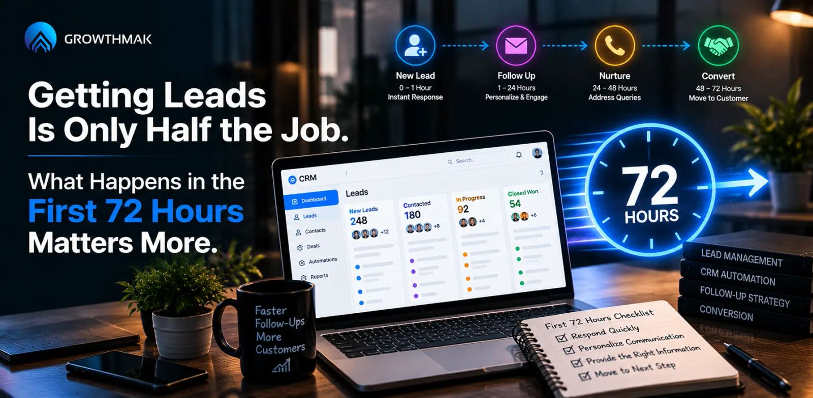
8. Nobody Follows Up After the First Click
Getting the form submitted is the start of the relationship, not the end of the task. If the only response is a generic autoresponder, plenty of leads go cold within days.
A short, human follow-up within the first hour converts a noticeably higher share of leads than the same message sent two days later.
- A confirmation message that sets a clear expectation for what happens next
- A follow-up call or email within the first business hour when possible
- A short sequence of two or three messages if the first attempt gets no reply
Which of These Problems Is Actually Costing You Leads
Most sites are not losing leads to all eight problems at once. Usually two or three of them are doing most of the damage, and the rest are minor.
| Reason | Fastest Way to Check | Typical Fix |
|---|---|---|
| No clear next step | Look at the homepage with a fresh set of eyes | Add one primary call to action above the fold |
| Weak site structure | Check how many clicks reach the contact form | Rebuild the path around lead capture |
| Landing page mismatch | Compare the ad promise with the page headline | Match the language exactly, page by page |
| Long forms | Count the required fields on the main form | Cut to the fields you truly need first |
| Slow mobile experience | Load the site on your own phone off wifi | Compress images, simplify the layout |
| No trust signals | Scroll the page looking for proof, not claims | Add two or three specific signals near the action |
| Limited contact options | Check if a phone number or chat exists anywhere | Add at least one alternative to the form |
| No follow-up | Submit your own form and time the response | Set a same-hour follow-up standard |
A quick way to confirm any of these is to pull web analytics for your top page and watch where visitors actually stop scrolling or drop off the form.
Fix the top one or two problems first, then check the numbers again before touching anything else. Changing several things at once makes it impossible to tell which fix actually mattered.
What Website Lead Generation Fixes Won't Solve
None of these fixes will turn the wrong audience into the right one. If your traffic is coming from people who were never going to buy, the best form on the internet still won't convert them.
They also won't rescue a broken sales process. If leads sit unanswered for days after they convert, the problem has already moved past the website and into how the business responds.
They will also not compensate for a price or offer that visitors have already rejected somewhere else. Removing friction only helps once there is real interest to capture.
Final Thoughts
A website that gets traffic but no contacts almost always has a website lead generation problem hiding in one or two of these eight places, not a demand problem.
Start with whichever reason matches what you already suspect, fix that one page first, and measure before moving to the next.
Small, specific fixes beat a full redesign nearly every time this is the actual issue, and they cost far less to test.
Give each fix a few weeks of real traffic before judging it. A change that looks flat after three days often needs more visitors before the pattern becomes clear, especially on lower-traffic pages that take longer to reach a reliable sample.
Ready to Fix Your Website Lead Generation? Explore Growthmak
Growthmak works with businesses that already have visitors and need the site itself to start turning them into leads, through structural fixes rather than another visual pass.
If your site needs a rebuild around lead capture instead of just a new look, Growthmak's website development team can start with a lead generation audit before the next redesign.
That audit usually starts with the same eight-point list covered above, applied specifically to your site rather than treated as generic advice.
If your website is attracting visitors but leaving potential leads behind, book a 30-minute growth call with Growthmak to identify the gaps and prioritize the fixes that can improve your lead generation.
Frequently Asked Questions
Customers usually leave because the page does not make the next step obvious or build enough trust. A clear call to action, shorter forms, faster loading, and a smooth mobile experience encourage more visitors to contact your business instead.
Start by identifying the biggest barriers instead of changing everything at once. Simplify your forms, place one clear call to action above the fold, and ensure landing pages match visitor expectations. Test each improvement separately to measure meaningful results.
Yes. Website design influences lead generation by making the next step clear and reducing confusion. A clean layout, readable content, and strong visual hierarchy consistently outperform complex designs because visitors can quickly understand what action to take.
A landing page converts better when it focuses on one offer and one call to action. Removing distractions, matching visitor expectations, and presenting clear benefits helps visitors make faster decisions, resulting in higher conversion rates and better lead generation.
A lead generation form should ask only for the essential information needed to begin a conversation, usually a name and email or phone number. Shorter forms reduce friction, improve completion rates, and allow additional qualifying questions after initial contact.
Website design problems make actions unclear through poor layout or messaging, while website development problems prevent lead capture because of technical or structural issues. Fixing development barriers first creates the foundation for design improvements that generate more enquiries.
Website optimization improves page speed, navigation, mobile usability, and overall performance to remove friction from the customer journey. Faster, easier experiences keep visitors engaged, increase trust, and help more people complete your desired conversion action.
Small improvements like better calls to action or shorter forms may produce measurable results within weeks if traffic is consistent. Larger changes require more testing because reliable improvements depend on collecting enough visitor data before making informed decisions.
Yes. Displaying a phone number alongside your contact form gives visitors a choice based on their preferred communication method. Offering both options increases trust, improves accessibility, and captures more leads than relying on a contact form alone.
Written by Growthmak Team · B2B Growth Specialists
All blogs