
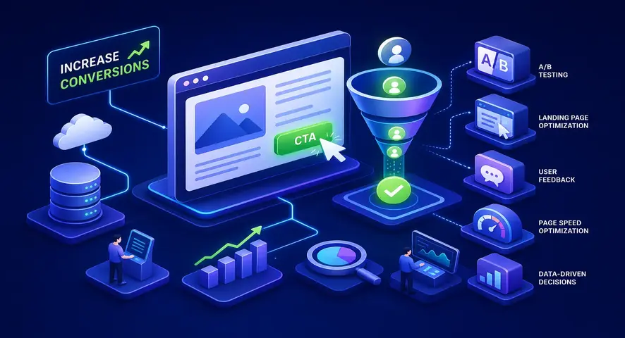
17 Proven CRO Tactics to Improve Website Conversions

To improve website conversions, start by auditing the pages where your most qualified visitors are dropping off, not by increasing ad spend. The average B2B technology website converts at just 2.64%. Financial services leads the chart at 5.01%, while real estate sits at the bottom at 0.98%. Most teams see those numbers and immediately pour more budget into a funnel that already has holes in it. At Growthmak, when we audit a B2B client's site, the same problems surface every single time: weak CTAs, bloated forms, and zero trust signals anywhere near the point of decision.
This article walks through 17 conversion rate optimization tactics structured around the highest-impact fixes first. You won't need to rebuild your site from scratch. You need to find where qualified visitors are dropping off and remove those friction points, one test at a time. By the end, you'll have a clear 30-day action plan to increase website conversions without touching your core design.
What your conversion rate is actually telling you
1. Industry benchmarks you should be measuring against
Before you run a single test, you need to know what you're comparing against. A "good" conversion rate is meaningless without industry context. Here are the 2026 benchmarks that matter for B2B:
If your site is converting below your industry average, you have a fixable problem, not a traffic problem. Chasing a universal "good" rate misses the point entirely. Compare your number against your vertical first, then set a realistic target for the next 90 days. For a broader set of 2026 conversion rate benchmarks across industries and channels, see this benchmark study.
2. How to run a quick conversion audit in under an hour
Open your analytics and find the single page with the highest exit rate. That page is where your revenue is leaking. Then ask three questions about it: does it have one clear CTA, does it load in under 3 seconds, and does it display at least one trust signal before the fold? If the answer to any of those is no, you have an immediate fix. The audit-first mindset means you repair the floor before you optimize the ceiling, and that principle drives every tactic in this article. For more on why a focused, thorough audit matters, see our guide on Beyond the Basics: Why a Deep Website Audit is the Ultimate Growth Catalyst.
CTA placement and copy to improve website conversions
3. Where you place your CTA changes everything
Your primary CTA belongs above the fold on every landing page, no exceptions. Pages with CTAs placed at every major scroll fold consistently outperform single-CTA pages by 20 to 35%. That means you need one in the hero section, one after your value proposition, one after social proof, and one at the bottom. The "one page, one goal" rule still applies: multiple competing CTAs dilute attention, so every button on the page should drive toward the same action.
On mobile, a sticky CTA bar at the bottom of the screen keeps the action visible as users scroll without interrupting the reading experience. This single change is one of the fastest ways to boost conversion rate on mobile traffic without any design overhaul.
4. Writing CTA copy that converts B2B visitors
Generic labels like "Submit" or "Learn more" are conversion killers. Action-specific copy tied to the actual offer performs significantly better. "Get my free audit" outperforms "Submit" because it tells the visitor exactly what they're getting. First-person phrasing also matters: "Start my free trial" consistently converts better than "Start your free trial" in B2B A/B tests because it creates a sense of personal ownership.
Match the copy to the visitor's stage in the funnel. Awareness-stage visitors need low-friction offers like guides or checklists, so your CTA should reflect that. Decision-stage visitors are ready for "Book a demo" or "Talk to sales." Mismatching the offer to the visitor's intent is a primary reason high-traffic landing pages convert poorly, and it's one of the first things we flag in a Growthmak audit.
5. Above-the-fold design principles that reduce drop-off
Your headline, subheadline, and CTA need to answer three questions instantly: what is it, who is it for, and what do I do next. Visual hierarchy should guide the eye toward the CTA, not compete with it.
On dedicated landing pages, remove all navigation links and exit points above the fold. Every element that isn't the CTA is a potential escape route.
Form optimization to improve website conversions: fewer fields, more qualified leads
6. The field reduction principle and why it works
Reducing a sign-up form from 12 fields to 5 fields increased mobile completions by 25% in a documented case study. For B2B, a frequent mistake is front-loading the form with qualification questions: company size, budget, timeline, phone number. That information is valuable, but asking for all of it upfront creates friction that kills conversions before the conversation even starts.
The practical rule for B2B lead gen forms: use 3 to 4 fields for top-of-funnel offers and 4 to 6 for demo requests. Name, work email, and company name are enough to start a B2B conversation. Collect everything else through progressive profiling in your sales sequence once you have the lead.
7. Mobile-specific form fixes that remove friction fast
Single-column layouts on mobile eliminate the layout confusion that kills completion rates. Use input type attributes (tel, email, number) to trigger the correct keyboard automatically. Enable autofill and consider LinkedIn authentication for SaaS and tech buyers who want to skip manual entry entirely. These aren't glamorous fixes, but they directly reduce bounce rate on mobile entry pages and are typically done in a single development sprint.
Add clear visual feedback on form submission, including a confirmation state with a message or redirect. A blank page after clicking submit creates doubt and often causes users to submit again, generating duplicate leads and eroding trust in your process.
Social proof and trust signals that close B2B deals
8. Why B2B buyers need social proof more than B2C buyers
B2B purchase cycles involve multiple stakeholders, higher transaction values, and longer deliberation periods. Trust has to be established before a visitor fills out a form, not after. Research on user-generated content and social proof indicates it can drive conversion rate increases of over 160% in some documented cases. That's not a marginal optimization, that's a fundamental shift in how buyers perceive your credibility.
9. The types of social proof that work near the CTA
Not all social proof carries equal weight in B2B. Here's what actually moves the needle at the decision point:
- Client logos from recognizable brands signal credibility within seconds
- Short, specific testimonials ("We booked 14 demos in 30 days") outperform vague praise every time
- Case study links with measurable outcomes give decision-makers something to share with their buying committee
- Star ratings and third-party review badges from platforms like G2 or Clutch reduce skepticism at the form level
10. Placement strategy: putting trust signals where doubt lives
One Hubstaff test found that testimonials and logos placed directly underneath the CTA produced a 10.95% conversion rate versus 6.89% for the control, a 59% lift. The principle is clear: place your strongest proof closest to where hesitation peaks. A small credibility cue in the hero section builds early trust; your most persuasive testimonial belongs directly adjacent to your primary CTA or form. Don't bury it below the fold where most visitors never scroll.
Page speed and mobile experience as conversion multipliers
11. The speed-to-revenue connection (with real numbers)
Portent's data shows ecommerce sites loading in 1 second convert at 3.05% versus 1.08% at 5 seconds. Conversion rates drop by 4.42% for each additional second of load time in the 0 to 5 second range. And 53% of mobile users abandon a page that takes longer than 3 seconds to load. These aren't soft engagement metrics; they're direct revenue impacts. For broader page load time research, see this page load time statistics roundup.
Your Core Web Vitals targets for 2026: LCP under 2.5 seconds, INP under 200 milliseconds, and CLS under 0.1. For conversion-critical pages like demos, pricing, and landing pages, treat 2 seconds as your ceiling and optimize toward 1 second wherever possible.
12. Mobile UX fixes that directly boost conversion rate
Place primary CTAs in the thumb zone (lower-middle of the screen) or use a sticky bottom bar. Minimum tap target size is 48x48 pixels; buttons smaller than that cause errors and frustration, not conversions.
Compress hero images, defer non-critical JavaScript, and serve assets through a CDN.
A B2B company that reduced load time from 4.5 seconds to 2.1 seconds by deferring non-critical JS and compressing images saw a 15% increase in mobile demo requests and a 10% drop in bounce rate. Those are the kinds of results that come from treating speed as a revenue problem, not a developer problem. Test on real iOS and Android devices, not just browser emulators, emulators miss the touch, scroll, and latency behaviors that affect real users in the field.
A 30-day CRO testing plan you can start this week
13. How to prioritize your first 3 to 5 tests
Start with the page that has the highest traffic and highest exit rate. That's where your revenue is leaking. Score each potential test using the ICE model: impact (how many visitors does this affect?), confidence (do you have data supporting the hypothesis?), and ease (how fast can you ship it?). Your sprint structure should look like this:
14. Week 1
Fix speed and mobile UX issues. These are floor repairs, not tests. Ship them.
15. Weeks 2, 3
Run CTA copy and placement A/B testing for conversions on your highest-traffic landing page.
16. Week 4
Add social proof near CTAs and test form field reduction.
17. The A/B testing tools worth using in 2026
For mid-market B2B teams, VWO combines A/B testing with heatmaps and session recordings, giving you behavioral context alongside conversion data. For teams that prioritize experiment velocity alongside analytics, Statsig offers built-in analytics depth worth considering in 2026. For privacy-first teams operating under strict compliance requirements, Convert and other top A/B testing tools provide GDPR-compliant testing with advanced targeting. Pair any of these with GA4 for funnel analysis and goal tracking across your full conversion path.
Metrics that tell you if your CRO tests are working
Your primary metric is conversion rate on the specific page being tested. Secondary metrics include form completion rate, scroll depth, and bounce rate. Track micro-conversions, video views, CTA clicks, time on page, as leading indicators before the final conversion fires. These signals tell you whether a test is moving in the right direction before you have enough data to declare a winner.
Give each test a minimum of two weeks and enough traffic to reach statistical significance before calling results. Ending tests early leads to false positives that waste your next sprint, it's one of the most damaging mistakes in a CRO program. This same data-driven framework is what Growthmak applies in its conversion-focused web development engagements, where B2B clients regularly see 7 Underutilized CRO Tactics to 5X Your B2B Website's Lead Conversion Rate and similar uplift within six months.
Your next step starts with one page
The path to improve website conversions isn't about rebuilding your site from the ground up. It's about identifying where qualified visitors drop off and systematically removing those friction points, starting with speed and mobile, then working through CTAs, forms, and trust signals. The 30-day plan gives you a structured way to prioritize what to test first and measure what's actually working.
If you want to compress that timeline or need a partner who has already built this system for B2B companies, Growthmak specializes in conversion-focused website development and full-funnel growth marketing that turns existing traffic into a qualified pipeline. We've managed over $5M in ad spend and helped clients generate $12M+ in revenue using the same principles outlined here. Read more on How to Improve Your B2B Website Conversion Rates.
Your next step is straightforward: open your analytics, find your highest-traffic page with the worst exit rate, and pick one test to run this week. The benchmarks give you the context. The tactics give you the roadmap. Now it's a matter of execution.
Frequently Asked Questions
1. How can I improve website conversions without increasing traffic?
Improving website conversions does not always require more traffic. Businesses can increase conversions by optimizing landing pages, improving call-to-action placement, reducing form friction, improving page speed, and creating a better user experience that encourages visitors to take action more effectively.
2. What are the best CRO tactics to improve website conversions?
The best CRO tactics usually include improving CTA placement, optimizing website forms, increasing page loading speed, adding trust signals, improving mobile experience, reducing bounce rate, and continuously testing website elements that directly influence conversion performance and overall user engagement.
3. Why is my website getting traffic but not generating conversions?
A website may receive traffic but fail to convert visitors because of poor user experience, weak call-to-action buttons, slow loading speed, confusing navigation, lack of trust signals, or landing pages that do not match user intent and fail to guide visitors properly.
4. Does website speed affect conversion rates?
Yes, website speed directly affects user experience and conversion rates. Slow-loading websites often increase bounce rate and cause visitors to leave before completing actions. Faster websites improve engagement, keep users active longer, and significantly improve website conversions across both desktop and mobile devices.
5. How do CTA buttons help improve website conversions?
CTA buttons guide website visitors toward taking specific actions such as signing up, booking a demo, making inquiries, or completing purchases. Proper CTA placement, strong CTA copy, and clear action-driven messaging help improve website conversions by making decision-making easier for users.
6. How can mobile optimization improve website conversions?
Mobile optimization improves website conversions by creating faster loading pages, easier navigation, better form usability, properly sized buttons, and smoother browsing experiences. Since many users visit websites through mobile devices, mobile-friendly design directly impacts overall conversion performance and user engagement.
7. How often should businesses test their website for conversion optimization?
Businesses should continuously test website performance because user behavior changes regularly. Ongoing testing of landing pages, forms, CTA buttons, mobile experience, and website speed helps identify conversion problems early and allows businesses to improve website conversions through consistent optimization efforts over time.
Related Blogs


.png)
Get Started with Growthmak Today!
Unlock your marketing potential with our expert team.